


Hallmark
Vintage Packaging Part 2:
1960-1969
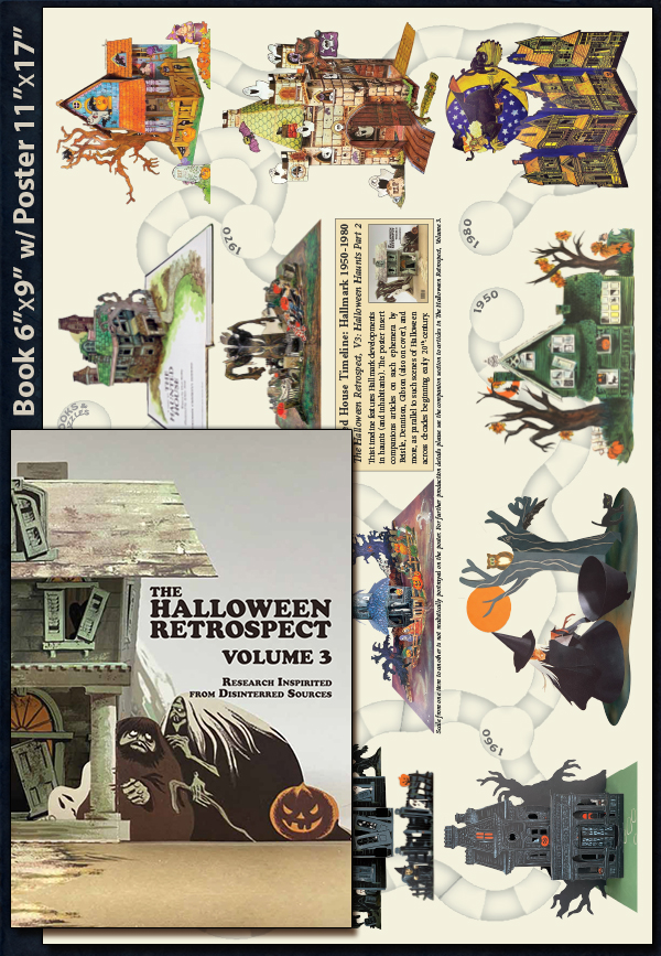
As mentioned in previous entry Hallmark Halloween: 1950’s, THR is developing data for vintage Hallmark Halloween centerpieces (those near and bit later than mid-century) to assist an article (on a different yet related topic) in works for collectors’ guide Volume 3 of The Halloween Retrospect. And rather than play catch-up after the book release, this and nearby entries will provide a glimpse at upcoming subject matter in the series (see THR’s bookstore). So, can one discover better dates for Hallmark’s party ephemera (assembly, honeycomb, and pop-up) circa 1950-1980? As with “Decrypting Dennison: Serial Number Guide Featuring Autumn Publications” (THR, V2), the key is likely found by examining Hallmark’s diverse products across the decade.
The review of Hallmark vintage Halloween includes:
Proceeding to the 1960’s era some general notes for Hallmark include:
1) The 1950’s version of the crown logo continues to appear on products into the 1960’s.
2) Ambassador (created 1959) offers new products (or Hallmark repeats) for other outlets.
3) Coutts-Hallmark is a Canadian branch created from a merger occurring in 1958.
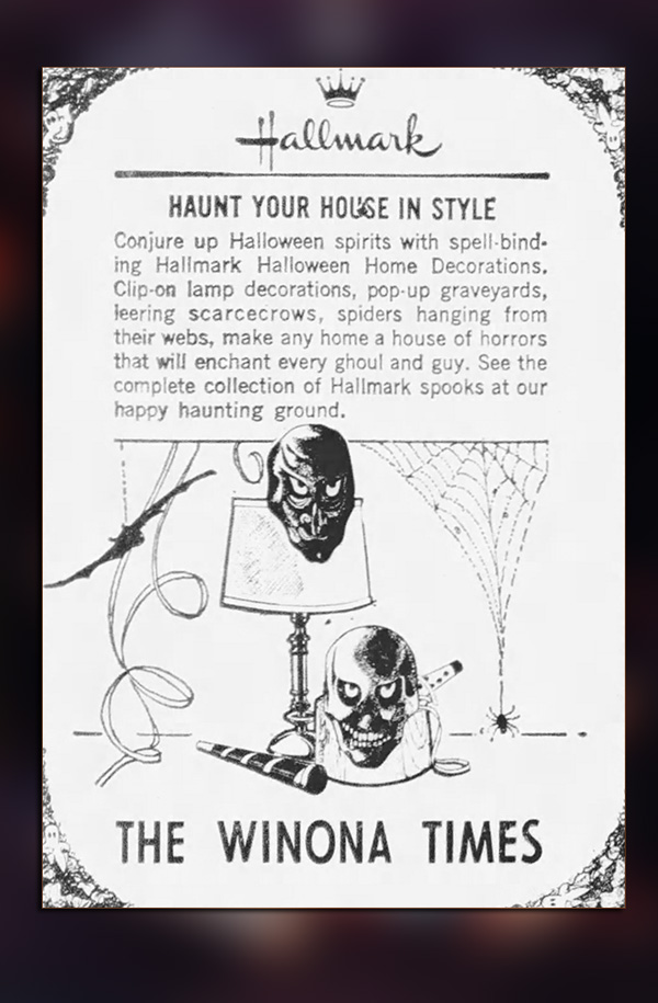
4) Matching sets continue, and Plans-A-Party is an official campaign in 1960 (per Hallmark)
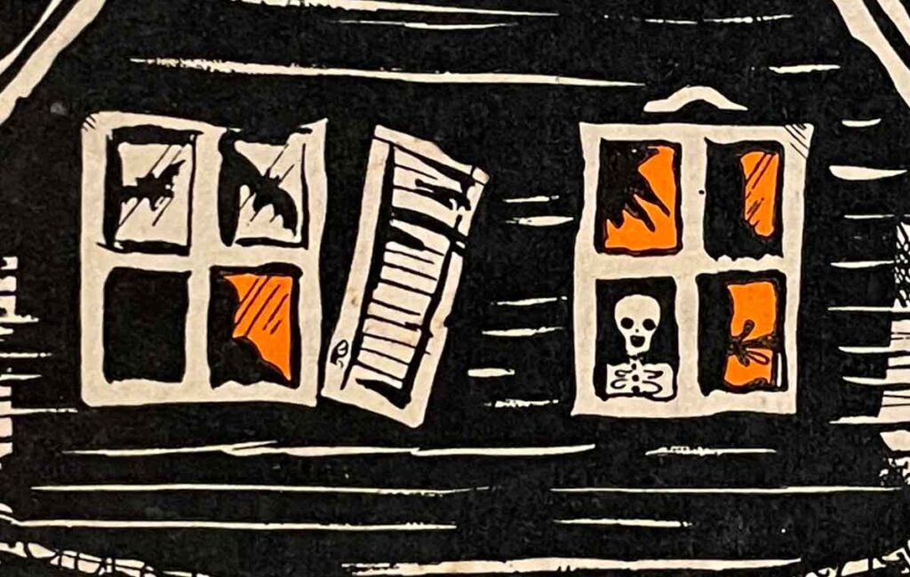
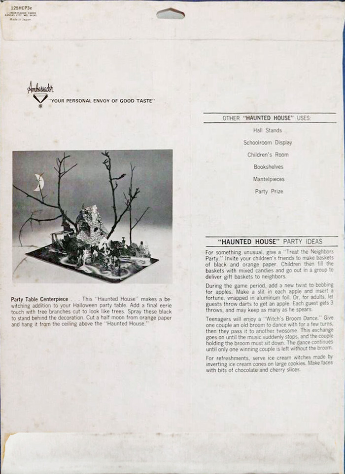
Close-up of Ambassador (aka Hallmark) Haunted House 125HCP-3E (above). This pop-up centerpiece is a fantastic visual dark-ride for anyone willing to peer into all the nooks and crannies – of detail on every surface – from front to back, to above and below. Item (with envelope) in THR archive collection with excerpts on Instagram@halloweenretrospecs.
NOTE 1: To create a packaging timeline, THR worked with numerous sources – including The Hallmark Archives, and tons of newspaper clippings together with tons of online sales data – for bits of helpful info. Therefore, what follows is the author’s own patchwork impression of style changes across time. It is not Hallmark’s claim of market availability in North America.
NOTE 2: Unless noted as a physical on-hand item, the images in this timeline blog series of Hallmark ephemera are digital re-masterings of rough-shod examples. it is decided that with absent marks, tears, general aging, etc. it will be easier to offer uncluttered representations.
Into the 1960’s:
Vertical Standard

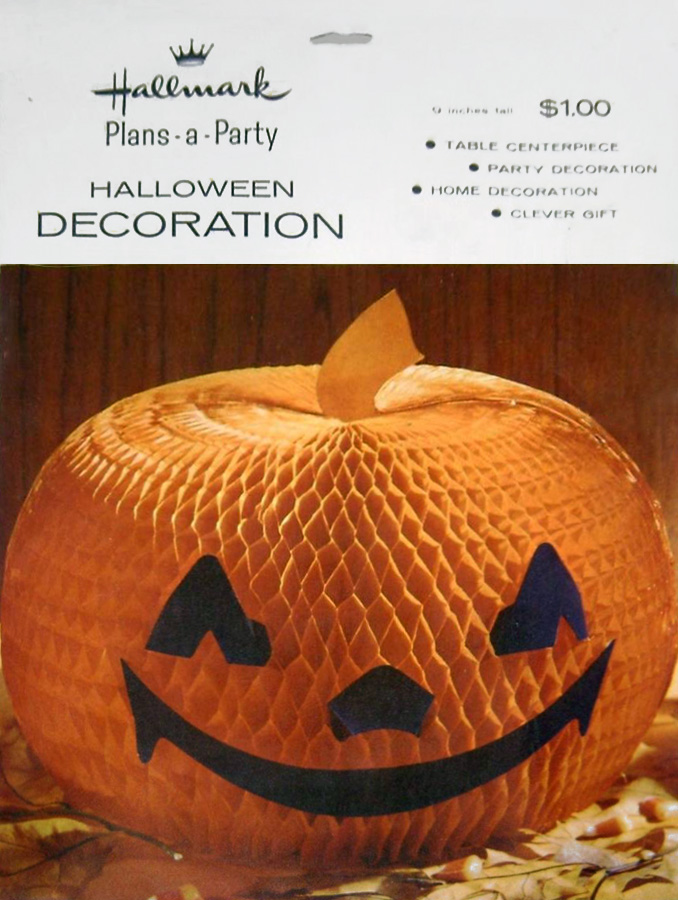
The honeycomb jack-o-lanterns (above) are notable as transitional packages of same products to include a Plans-a-Party update. See Party Decoration and Centerpiece (aka “Bewitching Sorceress “) in Hallmark Halloween: 1950’s. (Digital representations).
As you recall, around close of the 1950’s, (see Hallmark Halloween: 1950’s), the company’s package design is shifting toward a vertical layout with white header. The “Bewitching Sorceress” (directly above) appears to be a transitional piece in that the title font is large and playful as is the $1.00 pricing, and matching set items are mentioned in passing. She doesn’t really fit subsequent packaging standards (either with or without a Hallmark campaign that will become known as Plans-a-Party).
Early 1960’s:
A Plans-A-Party Plan
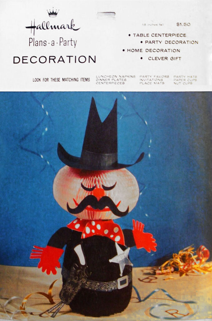
To place one envelope before another in the early 60’s is no easy task and, like the 1950’s, likely indicates overlap in design goals relative to market availability. In fact a store photo (Hallmark Archive ,1961) shows packages all with white-bar headers – yet with some amount variation. For example, Plans-a-Party (the company’s campaign of matching party wares) is said to release Valentine’s Day 1960 (Hallmark Archive), however, the Plans-a-Party label is not present on all packages – even those that become Plans-a-Party later. Does this means some products played catch-up to the campaign (see non-titled “Old West Sheriff” below) and/or perhaps some items are never part of a matching set…?
At first glance, characteristics for many centerpiece packages of this time include:
1) Product information within a white header tops the styled product photo.
2) Items are not always named yet text usually contains decor type, price, and height.
3) The fonts appear to be a standardized sans-serif for all text.
4) The back envelopes contain assembly instructions, and are otherwise plain.
5) The header is punctured for hanging store display.
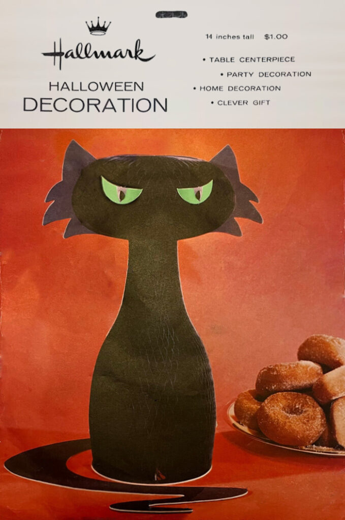
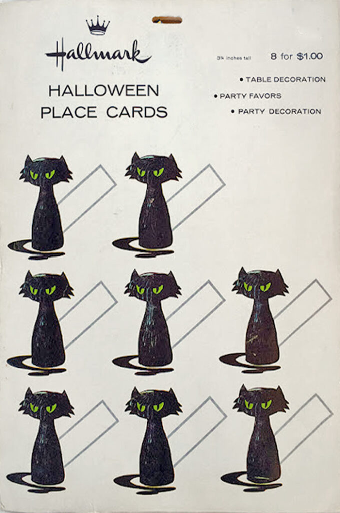
The un-named Halloween Decoration centerpiece and Halloween Place Cards (above) are obviously part of a set but not explicitly labeled . They appear to suggest a future phase for Plans-a-Party. Others like this include the non-titled Old West Sheriff (below), ” Miss Kitty Cat”, a Pink Rose gazebo, an Easter Gazebo (Asian style), and an Easter Decoration Bunny.
Therefore, with overlap noted, some variations in this envelope style include:
1) Marketing for Plans-a-Party is placed (sometimes later?) under the Hallmark logo.
2) Matching set items are prominently listed within the header space.
2) Centerpiece may be titled in an unusual font choice (such as Slugger Sam).

Some envelopes are a conundrum. Is the left envelope earlier to an update of the one at right? You can see a similar dual versions with the company-named Miss Kitty Cat (on worthpoint) that appears in large Hallmark Plans-a-Party ads from coast to coast in 1961.
Putting aside this envelope-evolution for a moment, it serves to offer an example of a Plans-a-Party matching set, and below shows how Hallmark envisions the product supply – with all your party needs co-ordinated yet a la carte – with invitations, napkins, coasters, plates, cups, place cards, nut cups, place mats, table cover, and centerpieces (the focus in these blog entries), etc. As you can see, Hallmark is truly prolific in this decade – and a real challenge for us today might be completion of all these various sets!
The ad series (1st photo) can be found online these days. The campaign appears in McCall’s throughout that year featuring a Party-of-the-Month. This early non-titled Plans-a-Party set was labeled on packages (2nd photo, 3rd photo) and items can be matched by SKU’s (as with Haunted House of the 1950’s). Fourth photo shows example of back envelope. (All digital).
A Busy 1960’s:
Expanding Products & Lines
Of course, as with the Hallmark Halloween: 1950’s, there are some interesting anomalies along the route of this research. Here are just a couple.
Monsters
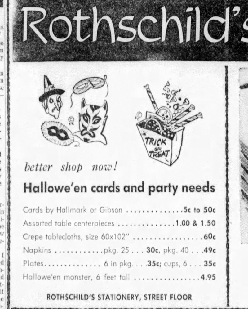
Now that honeycomb at this time is a material of major exploration for Hallmark, the 6′ monster (below) took advantage of new design capabilities. And packaging, in this case a box, is unlike most anything else. Perhaps this is explained by it’s early appearance as in the Rothschild’s ad from 1962 (below) with some of it’s design aesthetics from the 1950’s?
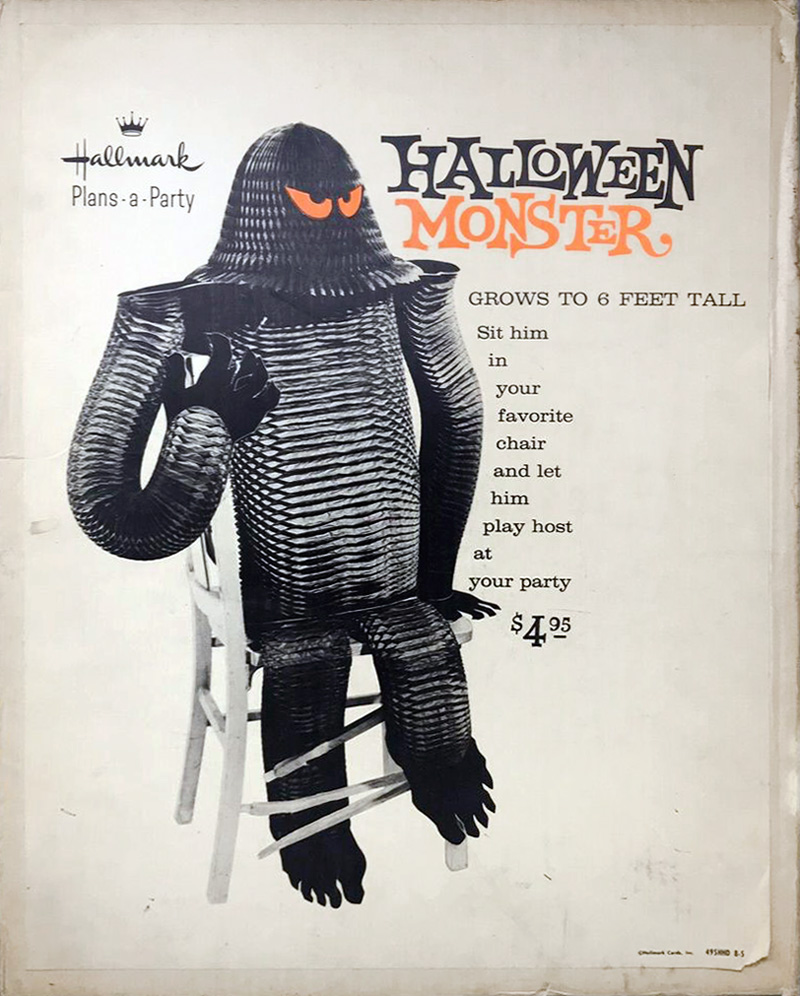
The Halloween Monster (left) is labeled with Plans-a-Party (dating to 1960 or later) spotted in an ad (right) from The Ithaca Journal, NY. Oct 22, 1962. Hallmark explores honeycomb monster designs in various sizes over the next decade.
Ambassador
Also of note (and rather important), is that Hallmark expands distribution capabilities after 1959 via a new line, Ambassador, to separate it from those stores carrying Hallmark. And while this card line hsd its own creations, it is said to have picked up retired Hallmark designs on some occasions. You can see a couple examples of this directly below.
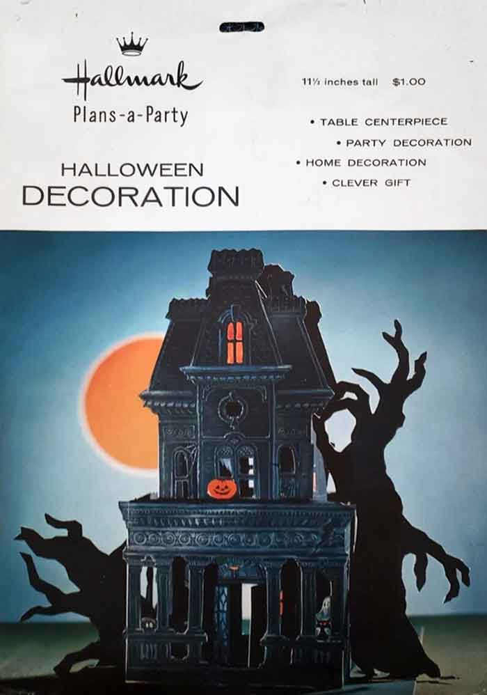
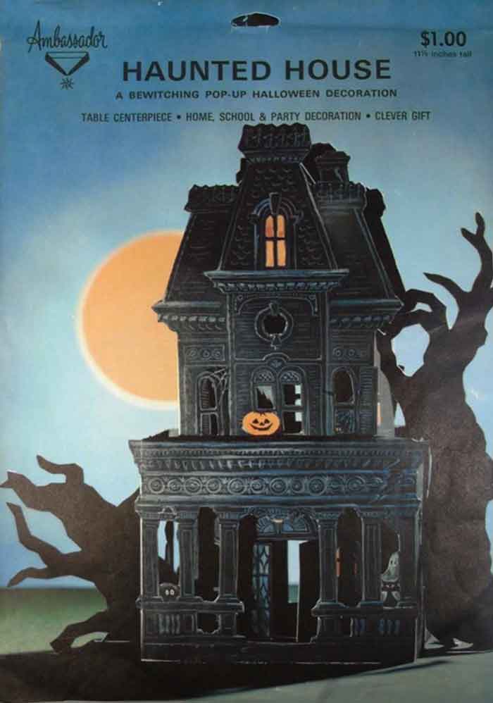
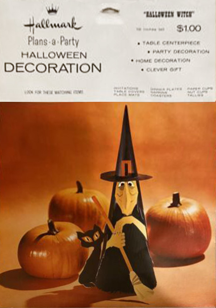
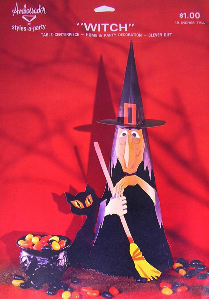
The centerpiece (1st photo) from Hallmark’s Plans-a-Party set of 1961 (appearing in an ad of that year, and corresponding to photo evidence from Hallmark Archives) dates earlier than Ambassador’s Halloween Decoration Haunted House (2nd photo). Likewise, Halloween Witch (3rd photo) by Hallmark appears later as Witch (4th photo) by Ambassador. (Note – 1st and 3rd photos THR collection, all others digital representations).
NOTE 3: As yet, there is no clear indication of Ambassador product dates – as the line does not seem as heavily advertised by its vendors. Do you have a good source???
Across the 1960’s:
Full Bleeds & Pop-Ups
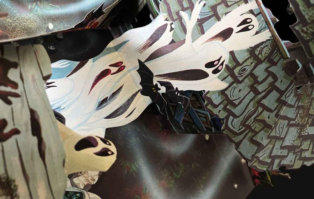
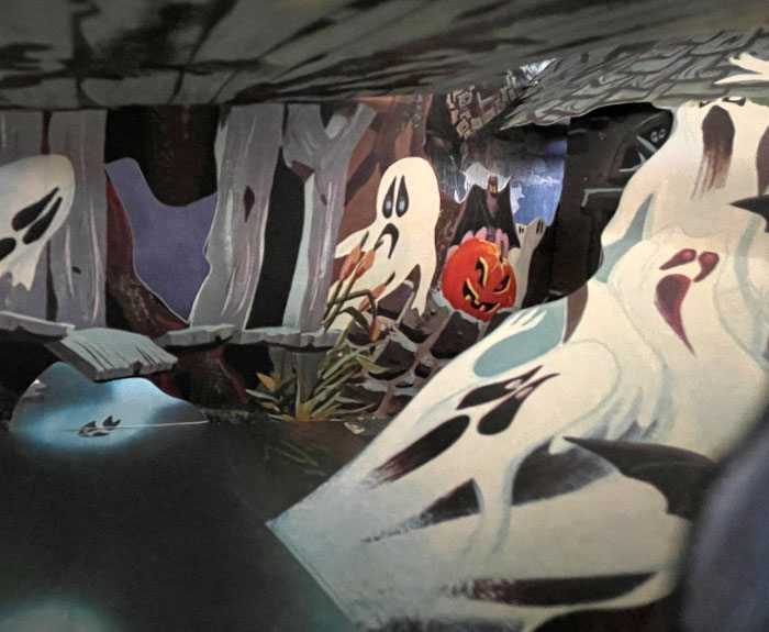
It’s fairly unimaginable to fly through such a busy decade so quickly, because there is much to be said – but let’s walk this back to the main goal here – dates via envelope design and other proof such as advertisements. It appears the next design phase for Hallmark’s creative staff is to nix the white-bar header and introduce full-bleed photography to the front of their envelopes – and 1963 is a banner year with the introduction of some very complex pop-up centerpieces (for all occasions) to include numerous Haunted Houses, as well as a Witch (mentioned in an ads 1967 and 1971), and a Graveyard (mentioned in an ad as late as 1969 and perhaps 1971) – remembering dates are shelf dates, not necessarily production dates.
Characteristics for pop-up centerpiece packages often include:
1) Full-bleed photos which will become predominant after the white-bar header.
2) Frequent use of sans-serif fonts (as below) though this may vary (as shown later).
3) Plans-a-Party is still the predominant campaign yet obscured as a checklist.
4) Back envelopes have black-bar headers to become common for sectioned copy.
5) The envelope is punctured at top for display options.
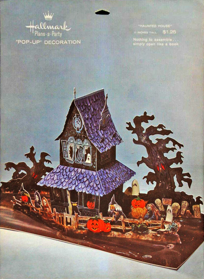
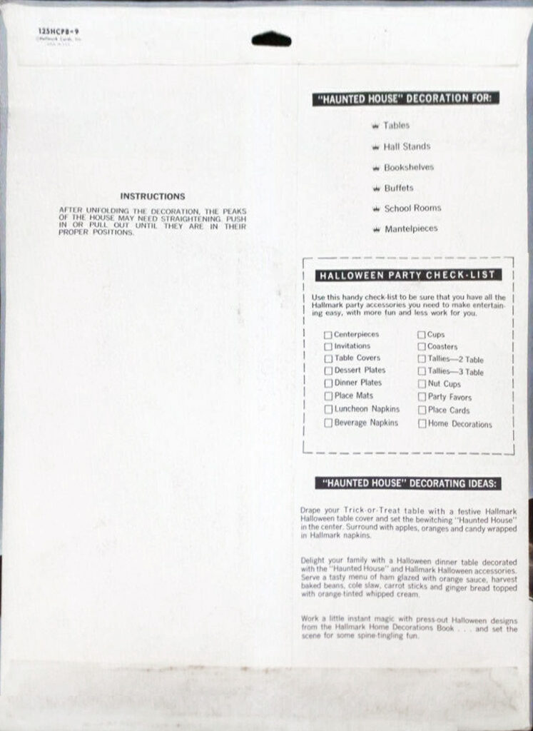
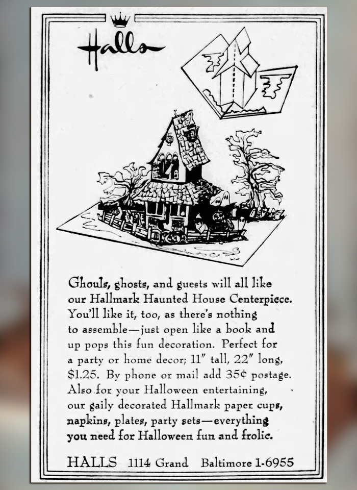
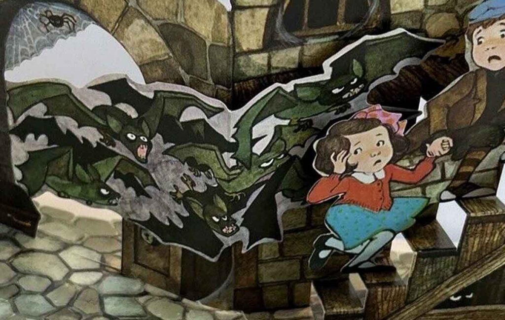
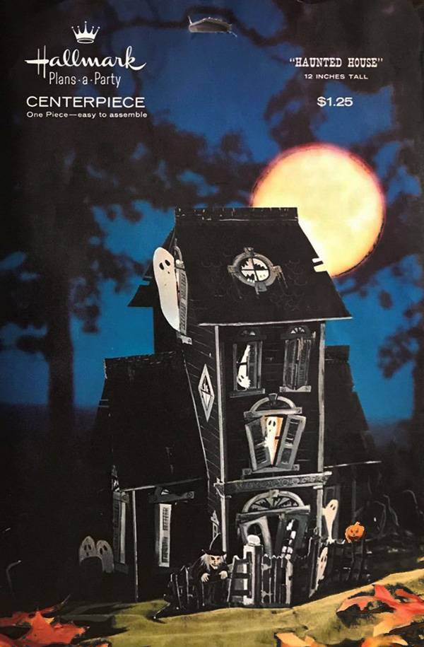
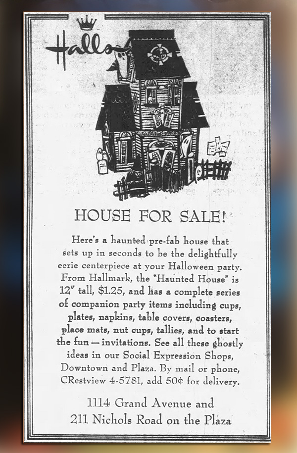
Hallmark’s Haunted House (1st and 2nd image) dates per ads circa 1963 to 1967. The envelope measures ~11.5″ w x 15″ h in The Halloween Retrospect collection (and imagine that the pop-up base would take twice as much table area). Images shown are digital representations. The ad (3rd photo) is from The Kansas City Times, MO, Oct 21, 1963.
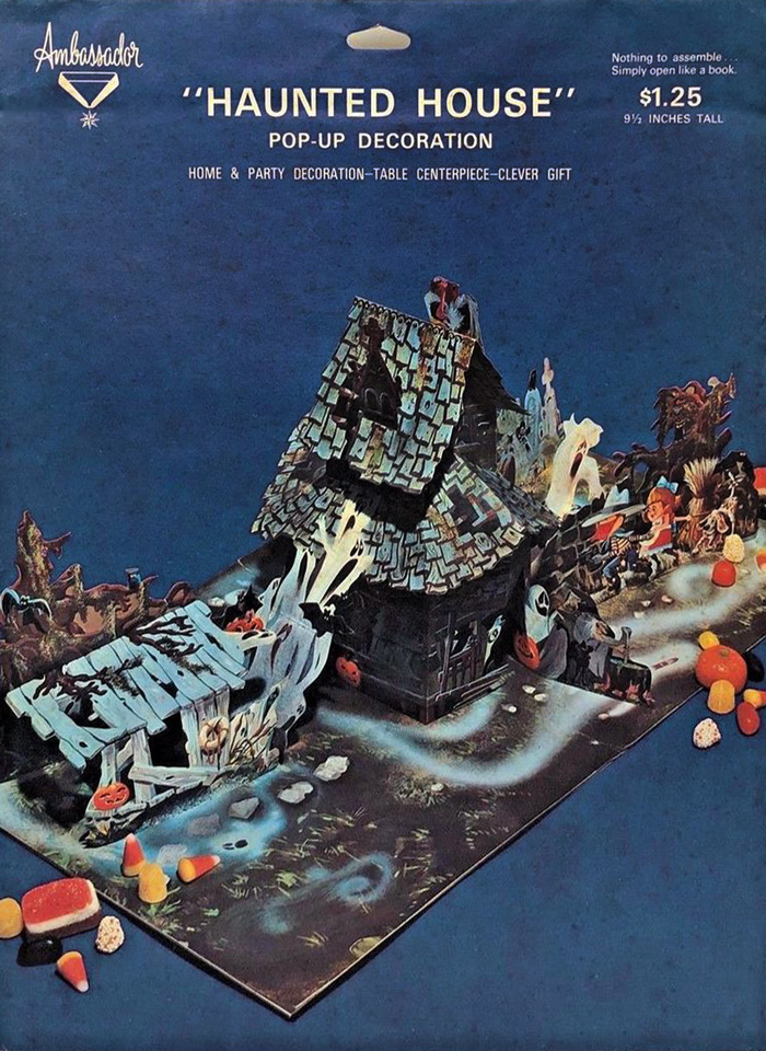
Although Haunted House and Halloween Witch (circa 1961, previously mentioned) are retired Hallmark designs released from Ambassador at later dates, the Ambassador line, as a separate interest, releases its own designs including a pop-up Haunted House. Their version is in many ways more intricate, and you can see more on Instagram@halloweenretrospecs. Date as yet determined. (Digital representations).
Mid to Late 1960’s:
Corner Titles, Barnum, etc.
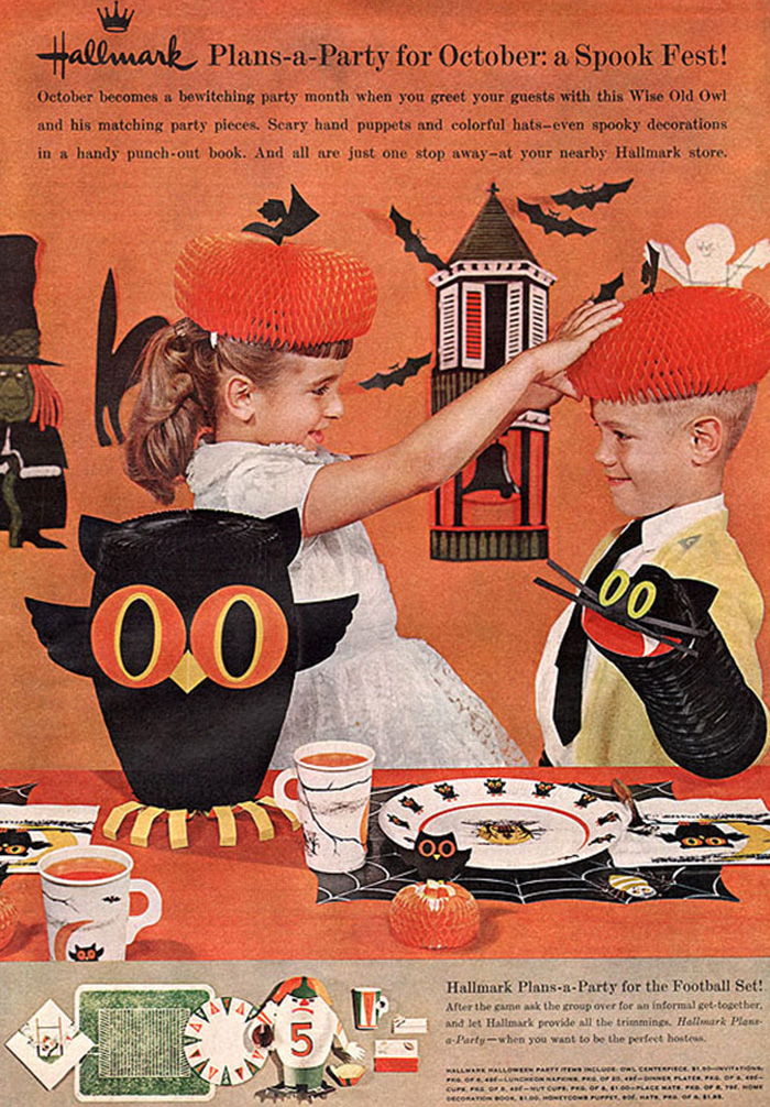
Returning to the realm of matching sets, some centerpieces (pop-ups, honeycomb, etc.) seem to more closely sync with Hallmark’s Plans-a-Party program. A few are shown in the gallery below (along with some information of dates appearing in newspaper ads).
Characteristics for this period of envelope include:
1) Printed information distributed about front (top corners) and reverse side.
2) Color photos are full-bleed images of styled displays of the internal contents.
3) Back left-side envelope usually shows black-on-white assembly (see Witch below).
4) Back right-side envelope has black-bar headers (see pop-up above and Witch below).
5) Title in parenthesis often Barnum*** (see gallery) but other fonts may appear.
*** For a time, mid-century product names (top right corner of packages in gallery below) use a standard font much like Barnum (as suggested by one knowledgeable in such matters). And THR has seen the font on many products from other seasons. However, as you can see by Witch (circa 1969) there is some amount of non-standard selection, perhaps later in time? A former employee states that in their time, “there was no standard font for G&O (Gift & Occassion) product lines other than for corporate logos and stock numbers. It came down to what the Lettering Department artist recommended and what the Art Director approved.” (Guthrie, 2023).
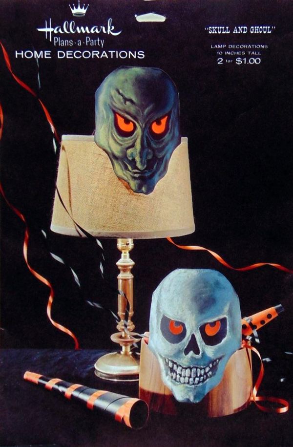
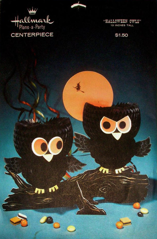
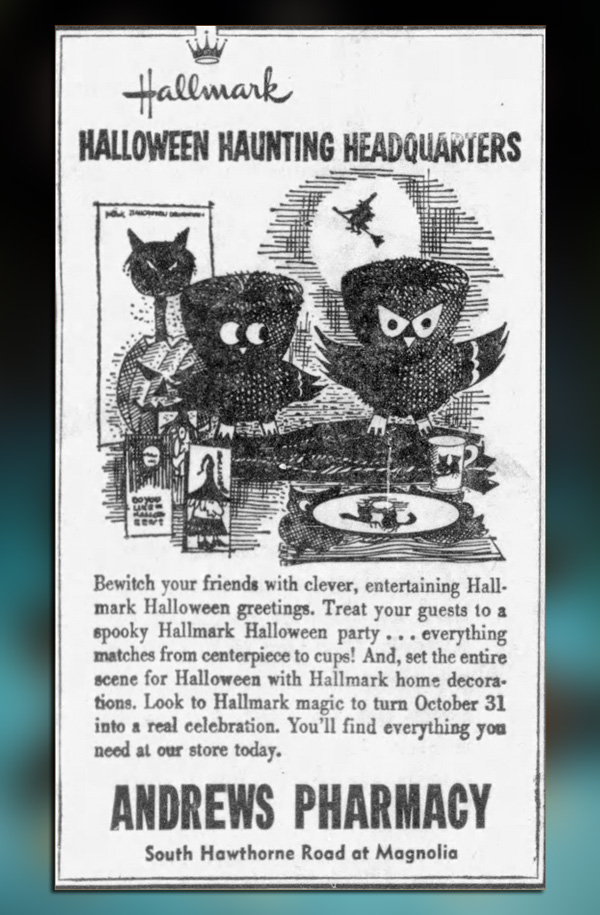
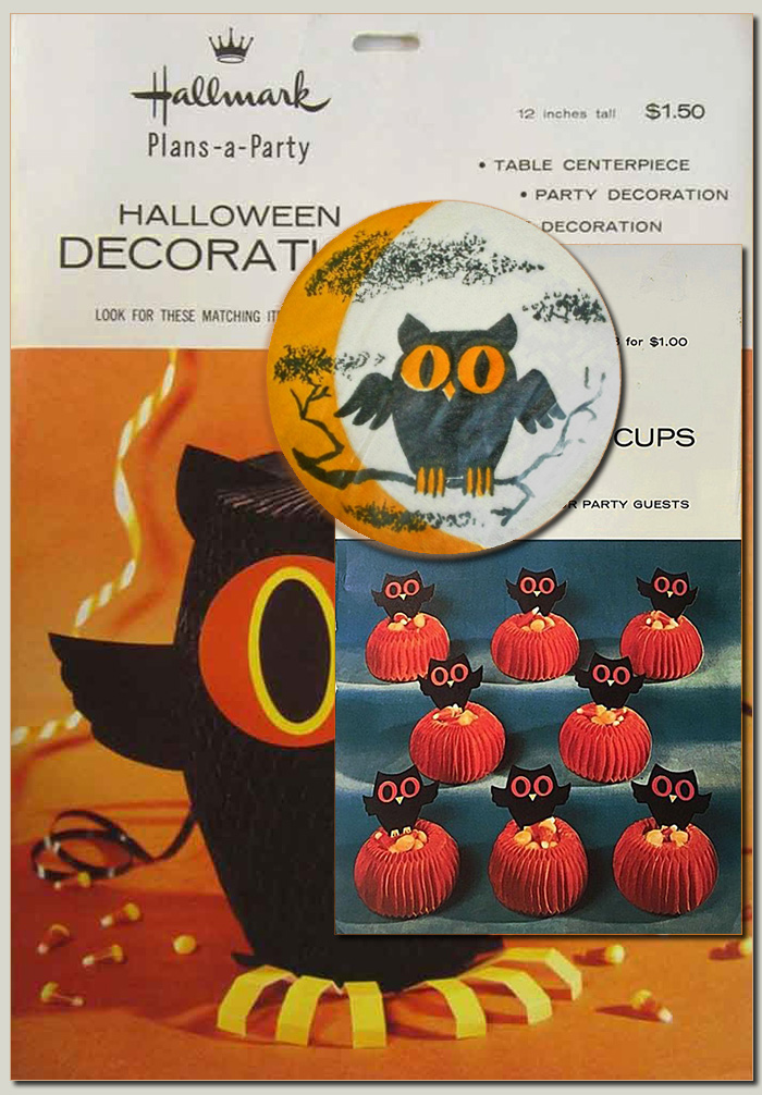
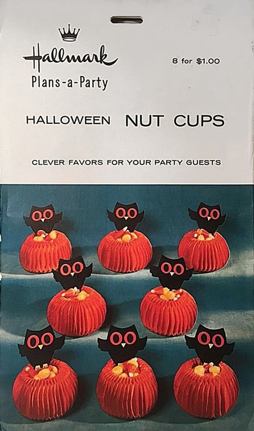
Haunted House (1st, 2nd images) shows envelope front and an ad from The Kansas City Times, MO, Oct 25, 1966 as noted in appearances from 1966-67. Skull and Ghoul (3rd, 4th images) shows envelope front and an ad from The Conservative, MS, Oct 24, 1968 as noted in appearances from 1967-69. Halloween Owls (5th, 6th images) shows envelope front and an ad from Winston-Salem Journal, NC, Oct 31, 1965 as noted in appearances of that year. (All images digital with Haunted House, Skull and Ghoul found in THR archive).
The 1960’s close with at least two different witch designs (the other standing with a broom in hand), but the example below rather encapsulates stylistic changes to come, as Hallmark moves from spooky to light-hearted. It is offered here to show the front and back of packaging from this time period, and the item is mentioned often in ads dating to 1969.
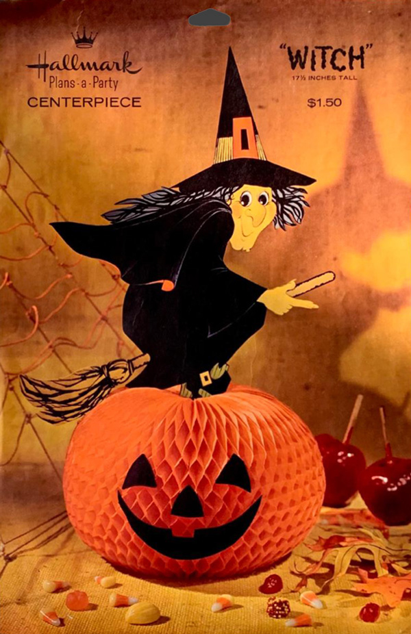
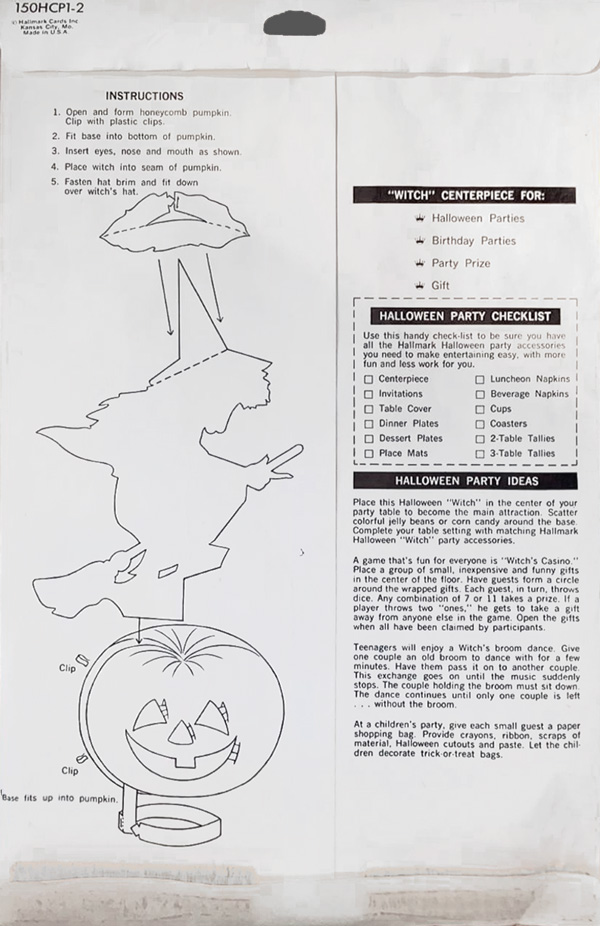
The end-of-the-decade Hallmark Witch (seen in ads during 1969 and as late as 1974) is a good example of envelope design in the late 60’s time period. Notice (on the reverse) there are instructions on the left, with black-bar headers on the right. (Digital representations).
Into the 1970’s:
The Impromptu Party
When we reach the end of the 1960’s, Hallmark appears ready to forego role of party-planner, at least in envelope marketing, and “Happy Hauntings” (below) is a good example of a new standard (in layout and humor) to define much of the next decade. The final entry in this series (of Hallmark envelope design 1950-1980) is up next, with a quick romp through the seventies.
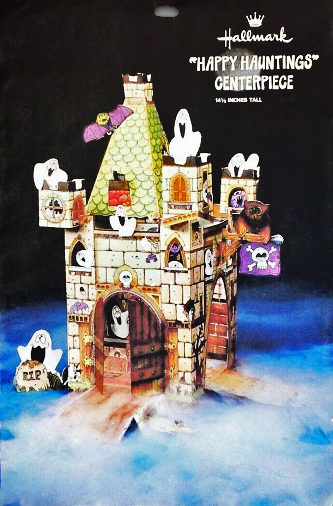
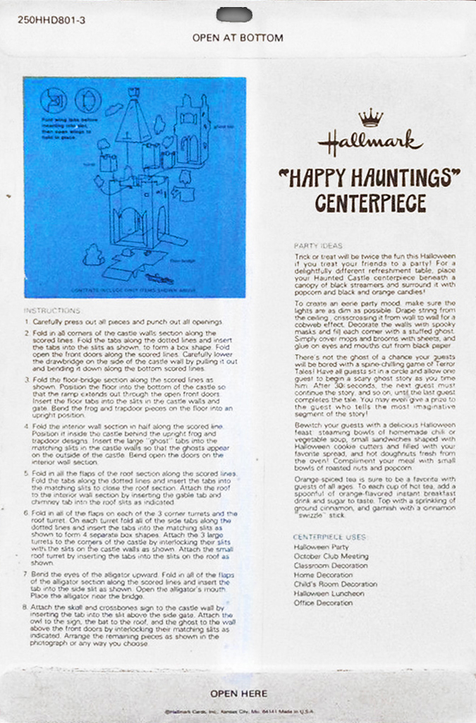
Hallmark’s ghost-ridden castle centerpiece Happy Hauntings is a good example of jocularity that will inform designs of the 70’s. (Digital representation photo).
The review of Hallmark vintage Halloween includes:
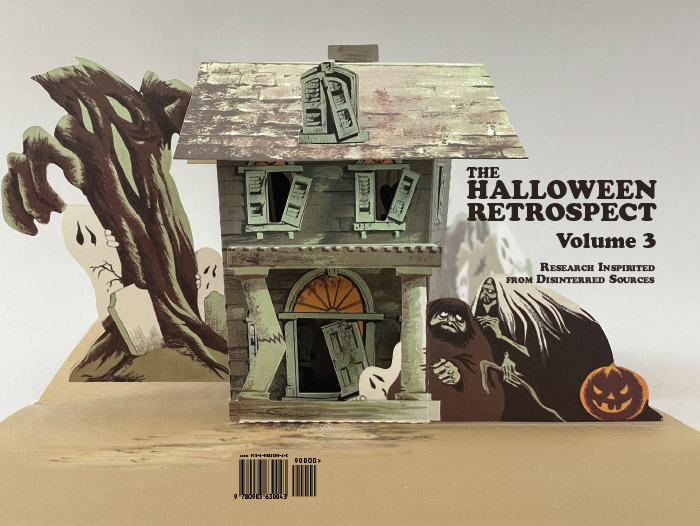
The Halloween Retrospect
Volume 3
Here is a link to more website info about The Halloween Retrospect (a new research-based guide on the vintage market of for Halloween collectors) and here is a direct link to The Halloween Retrospect bookstore to purchase a copy via Etsy checkout.
Follow THR on Instagram @halloweenretrospecs
Follow THR on Facebook Halloween Retrospect