Hallmark
Vintage Packaging Part 3:
1970-1979
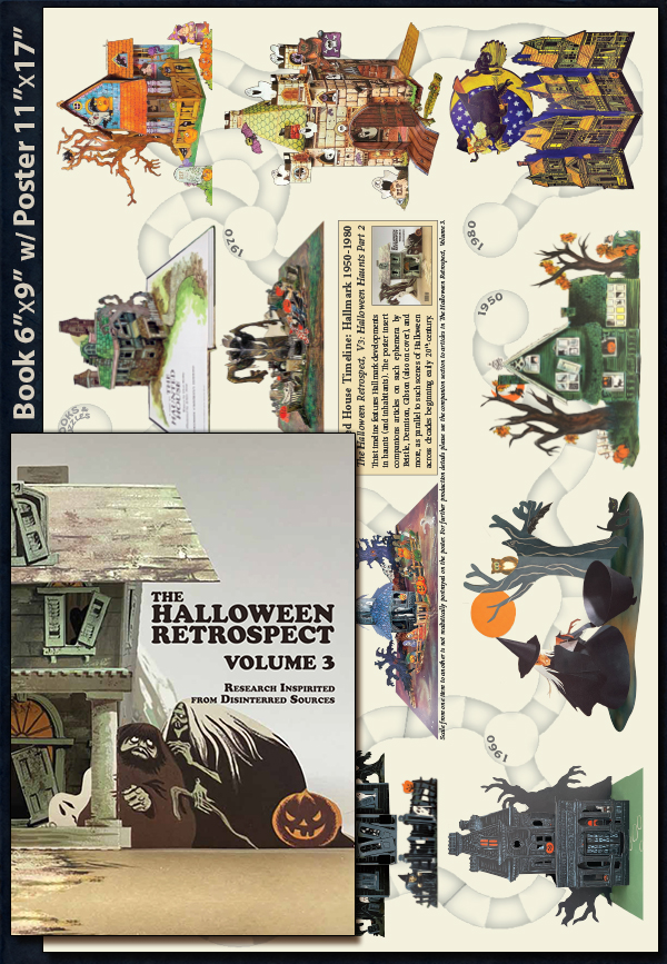
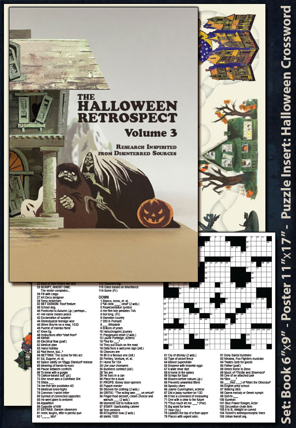
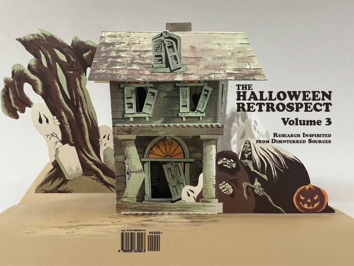
This entry is Part 3 in a short blog series examining Hallmark (1950-1980) ephemera – mainly assembly, honeycomb, and pop-ups. As stated in Hallmark Halloween: 1950’s and Halloween Hallmark: 1960’s, THR is writing these entries to develop data for vintage Hallmark Halloween centerpieces to assist an article (on a different topic for collectible guide The Halloween Retrospect, Volume 3 to appear in THR’s bookstore). As with “Decrypting Dennison: Serial Number Guide Featuring Autumn Publications” (THR, V2), this entry for Hallmark 1970’s is pursued to verify the changes over the various decades.
The review of Hallmark vintage Halloween includes:
Proceeding to the 1970’s era some general notes for Hallmark include:
1) The crown logo of the 50’s and 60’s continues to appear on products.
2) Copyright dates begin appearing but instances may signify other intellectual properties.
3) Ambassador will begin adding bar-codes on the back of their envelopes.
NOTE 1: To create a packaging timeline, THR worked with numerous sources – including The Hallmark Archives, and tons of newspaper clippings together with tons of online sales data – for bits of helpful info. Therefore, what follows is the author’s own patchwork impression of style changes across time. It is not Hallmark’s claim of market availability in North America.
NOTE 2: Unless noted as a physical on-hand item, the images in this timeline blog series of Hallmark ephemera are digital re-masterings of rough-shod examples. it is decided that with absent marks, tears, general aging, etc. it will be easier to offer uncluttered representations.
Into the 1970’s:
Halloween Whimsy
As the previous article Halloween Hallmark: 1960’s comes to a close, it seems Hallmark enters the new decade with some identifiable changes to marketing and envelope design, as well as an overall shift in mood from spooky to light-hearted. Perhaps 1970’s Hallmark is spooked (as a common sentiment of the time) by impressions of Halloween out-of-control? In fact, as will be shown later, the most advertised set of 1979 is de-fanged and aimed at adults. Whatever the case, this blog is not here to question aesthetics, but identify dates on items by packaging – however, if readers know of designs with a more classic vibe than the examples yet found, the author will be happy to update this entry accordingly…
Characteristics for many centerpiece packages of this time include:
1) Product title information moves predominantly to the envelope’s top right corner.
2) The back envelopes contain assembly instructions (in a colored box) with generalized copy.
3) Hallmark will add some copyright dates (circa 1976) but note section below on caveats.
4) Ambassador products (perhaps per distribution chain) will introduce a bar code.
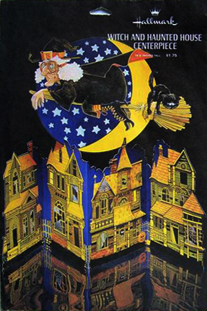
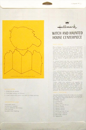
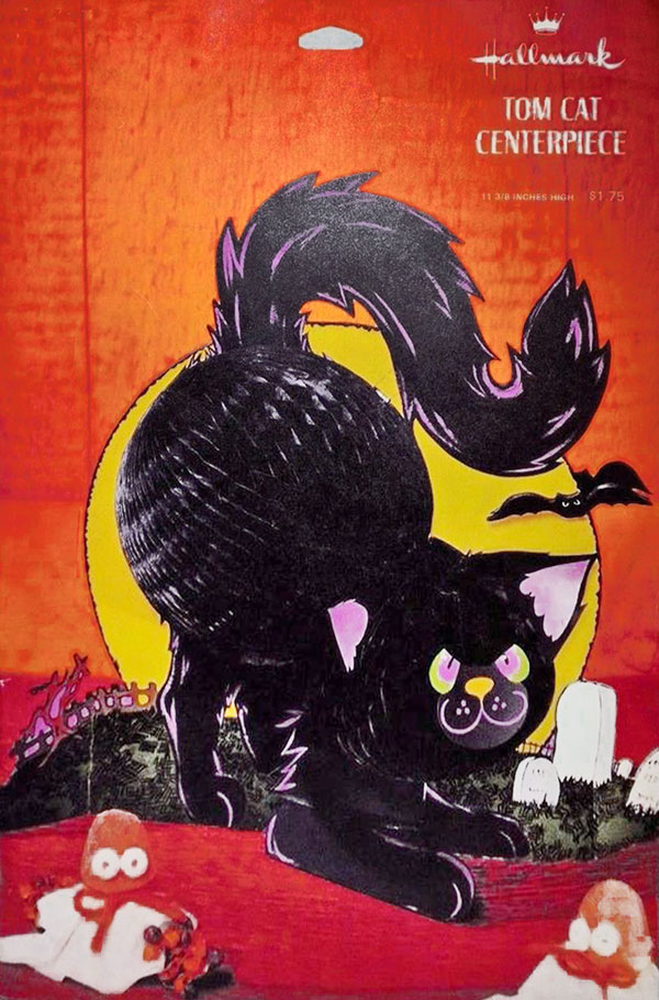
Witch and Haunted House Centerpiece and Tom Cat Centerpiece show general design of packaging in this period – with back of envelopes like those below. (Digital representations).
Early to Mid 1970’s:
A Change in the Weather
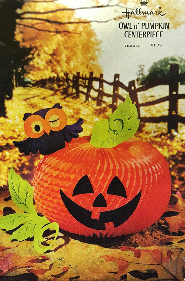
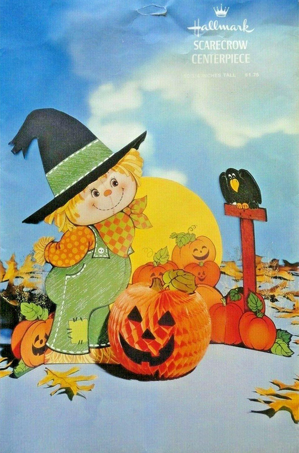
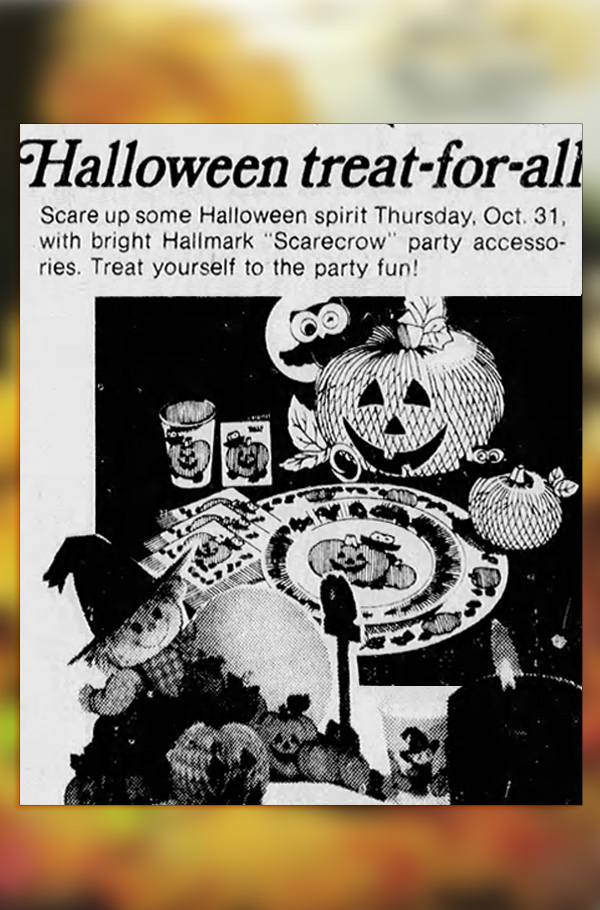
Owl and Pumpkin Centerpiece and Scarecrow Centerpiece (while reminiscent of older characters from Hallmark’s oeuvre, like the vulture, most are now rendered with innocence). The ad is from Nevada State Journal, Reno, Oct 16, 1974. (Digital representations).
One of the more distinguishing features for front envelopes, in the early decade, is a setting for products that mixes both studio and landscape photography. In the galleries above, notice that the foreground is an autumn still life, while backdrop is an outdoor environment. The galleries offer front and back envelope design, and a relative advertisement for the purposes of dates.
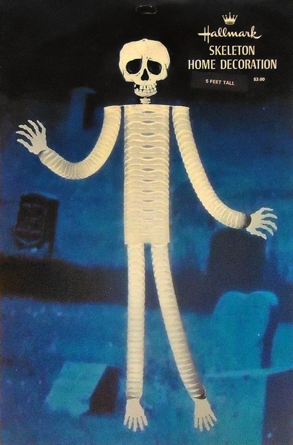
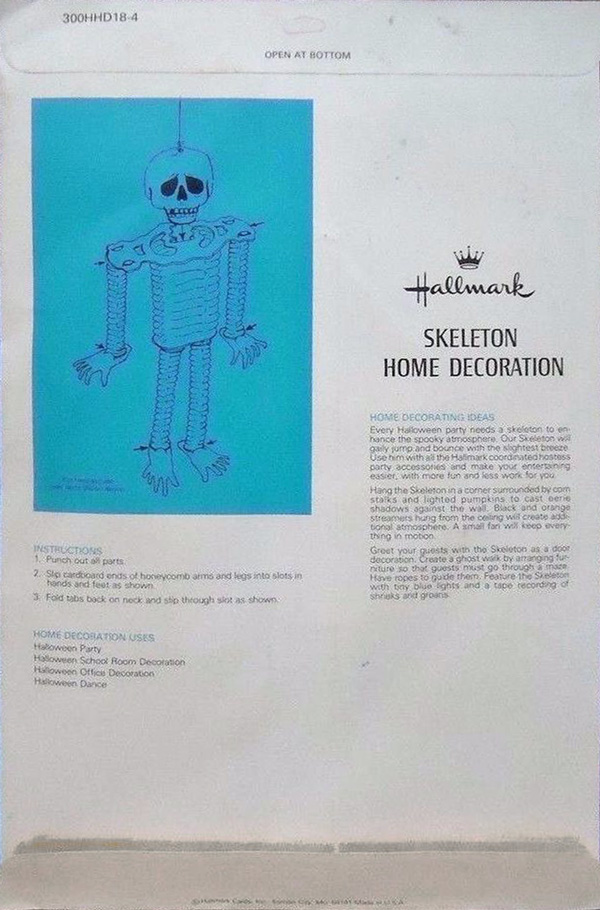
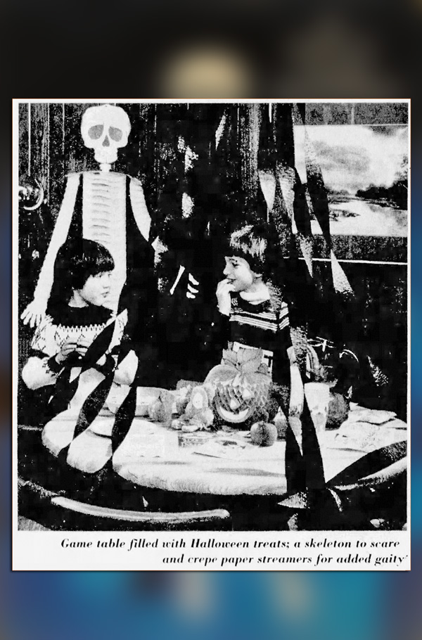
Skeleton Home Decoration offers some classic chills with a graveyard in background. The photo is an excerpt from “There’s no trick to treating friends to a party” found in The Reporter Dispatch, White Plains, NY, Oct 25, 1977. (Digital representations).
Across the 1970’s:
Exploring Other Nooks
While the 1950’s introduce more occasions represented by product offerings, followed by the 1960’s with more products across new outlets (such as with Ambassador) – the 1970’s allow Hallmark’s creative team to stretch out into other formats. While that seems to mean, as examples above might indicate, that less time was spent with items for Halloween-specific occasions – it did make for great products applicable all year.
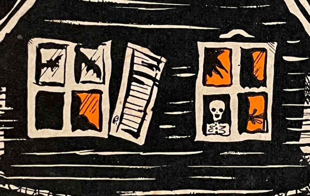
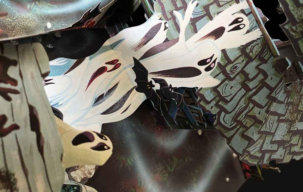
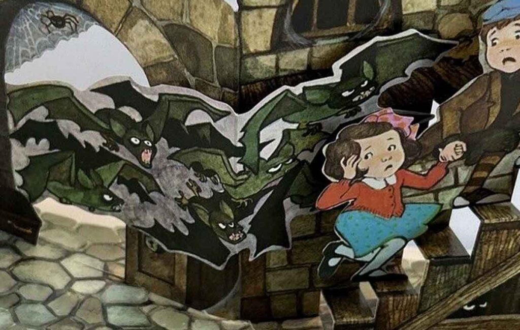
The first item worth mentioning is A Visit to the Haunted House, A Halloween Pop-Up Book. Here we see Hallmark’s creative team of artists and paper engineers, (who at earlier times worked on card crafts as mentioned in an article from Hallmark Archive) evolving into the realm of book arts. This particular book is apparently so popular as to have a total run in range of 300,000 copies across editions since a 1972 release as mentioned in a presentation by Pat Paris at the Second Biannual Movable Book Society Conference (Rubin, 2018).
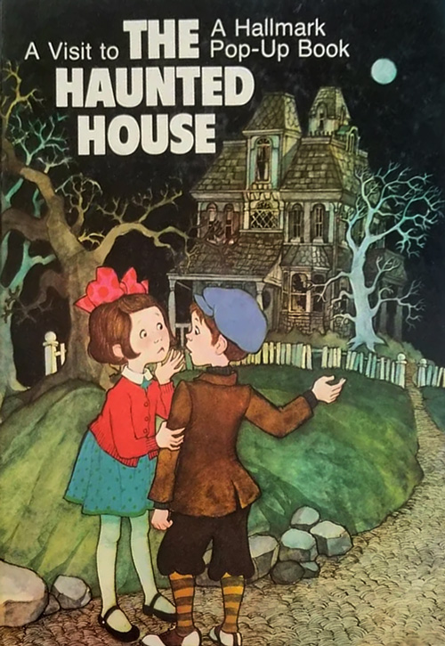
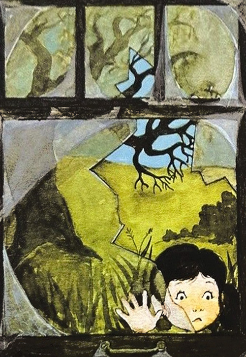
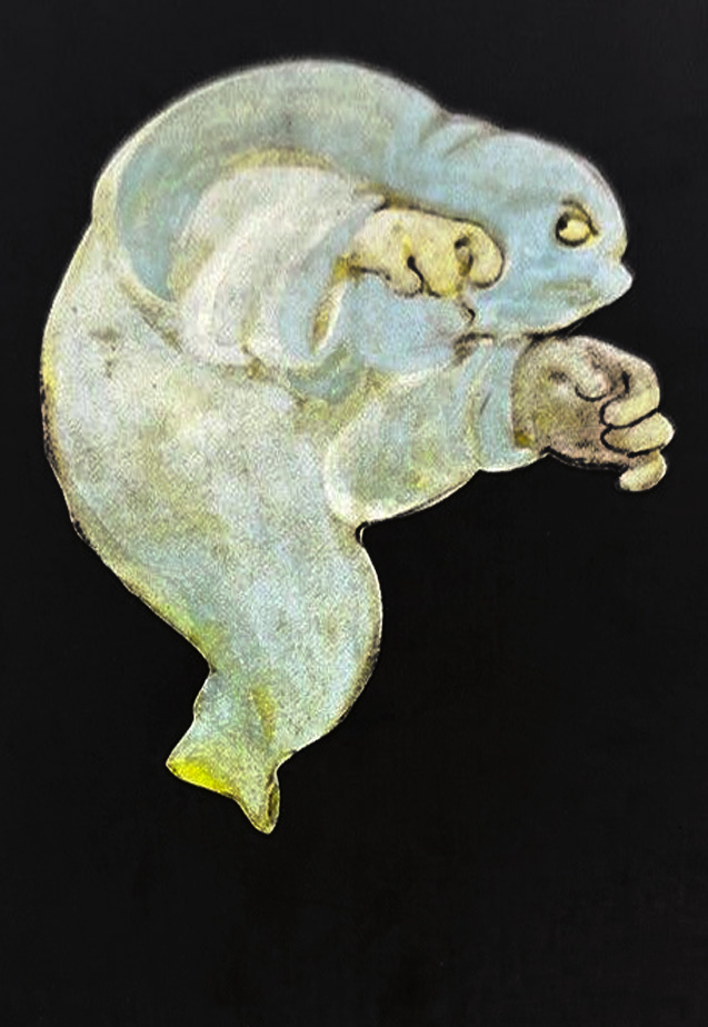
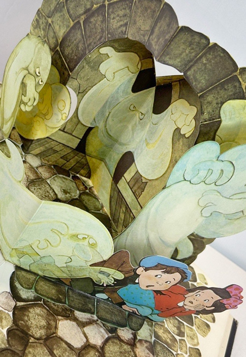
Hallmark’s A Visit to the Haunted House expands the creativity of the card production team in a new direction. Shown here is book cover (1st image) various end pages details (2nd, 3rd images) and a full-spread pop-up detail (4th image). (Digital representations).
Hallmark acquires Springbok Puzzles earlier (1967) and read more about their history on this site: Springbok Puzzles History. Below are two examples from the Hallmark period of the 1970’s – The House on Haunted Hill (1973) and Monster Maze (date uncertain) that show the alignment of creativity occurring in that time.
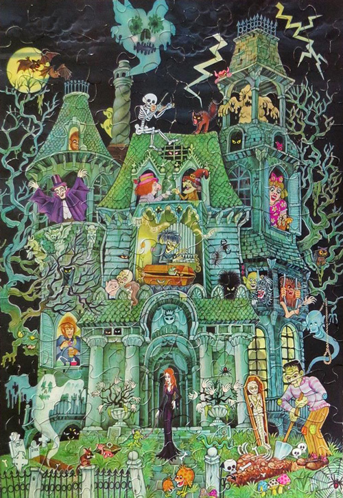
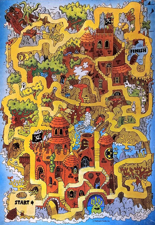
The House on Haunted Hill (left) 1973, Monster Maze (right) signed by Hallmark card artist (Robert) Bob Martin copyright Hallmark from Springbok Puzzles. (Digital representations).
Given the example book and puzzles (above), it is no wonder a similar sensitivity spills into designs of certain centerpieces of this decade (even if the 1960’s is likely a passing high point for this type of product). The item below is wonderful for the detail (previously lacking in the earlier centerpieces at beginning of this blog entry) and like book and puzzles may be an item that can reach beyond that of a strictly October offering.
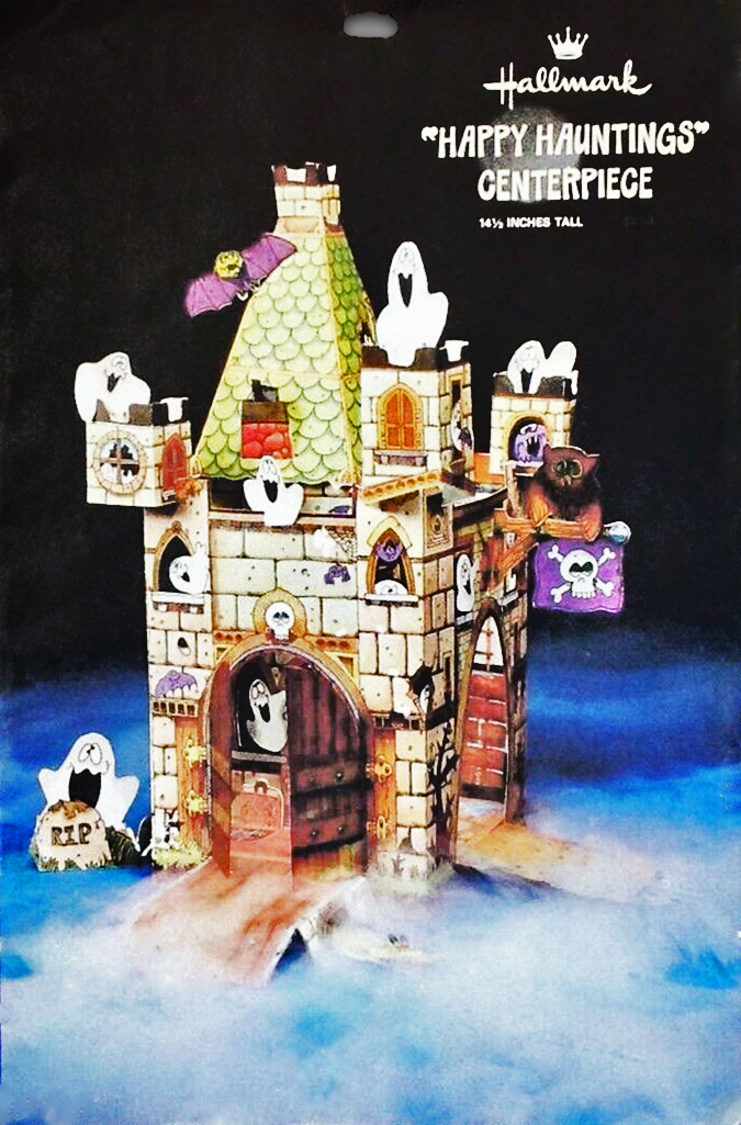
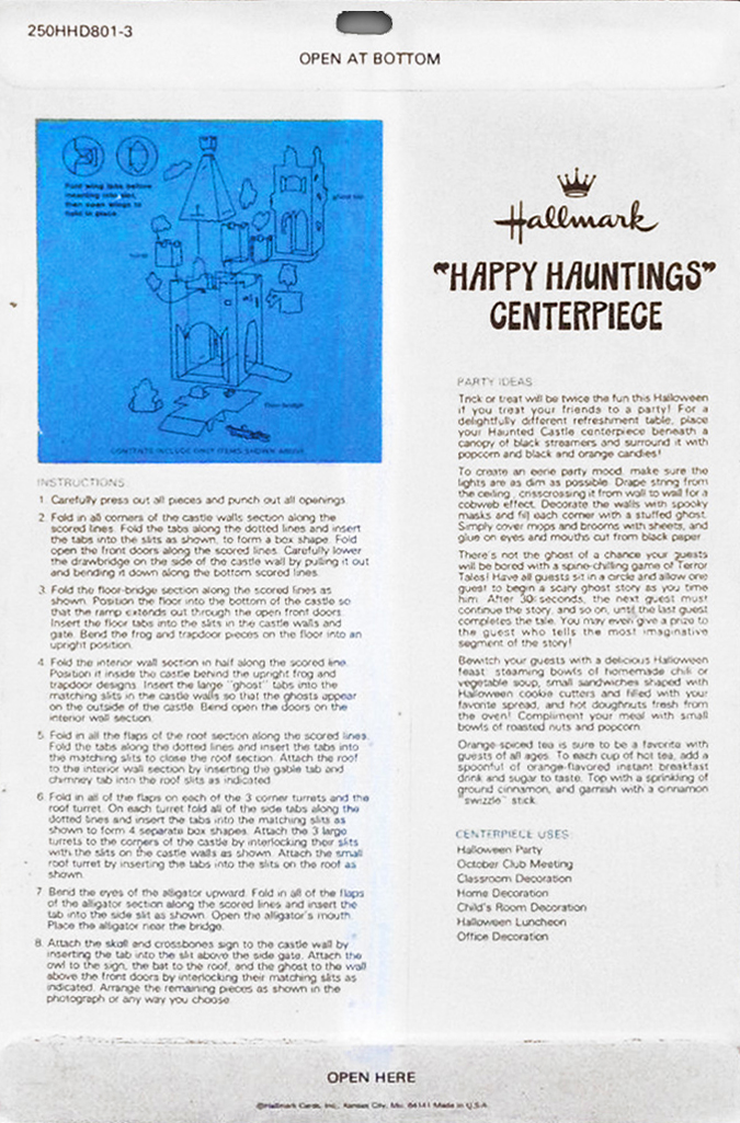
Hallmark’s ghost-ridden castle Happy Hauntings is an example not only for detail of some items, but also the jocularity that informs the 70’s. (Digital representation).
Mid to Late 1970’s:
More than Just Peanuts
There are numerous examples of Hallmark items featuring Peanuts across the decades… and Hallmark explores licensing other properties (as honeycomb and centerpiece designs) featuring Richard Scarry, Joan Walsh Anglund, Jim Henson’s The Muppets, Raggedy Ann and Andy, Scooby Doo, etc,. in pieces from the late 1970’s. These are mentioned to note something important regarding copyright (and for who) versus release dates. For example, the “Great Pumpkin” Centerpiece (below) has multiple copyright dates listed for United Feature Syndicate as 1952, 1958, and 1965, however, those are not copyright dates for Hallmark’s centerpiece rendition. In determining the age of this item we might look at vintage ads, if available, because envelope design places this squarely in the 1970’s.
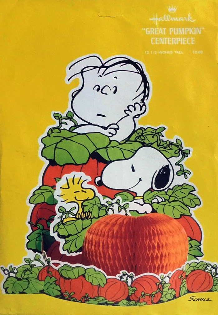
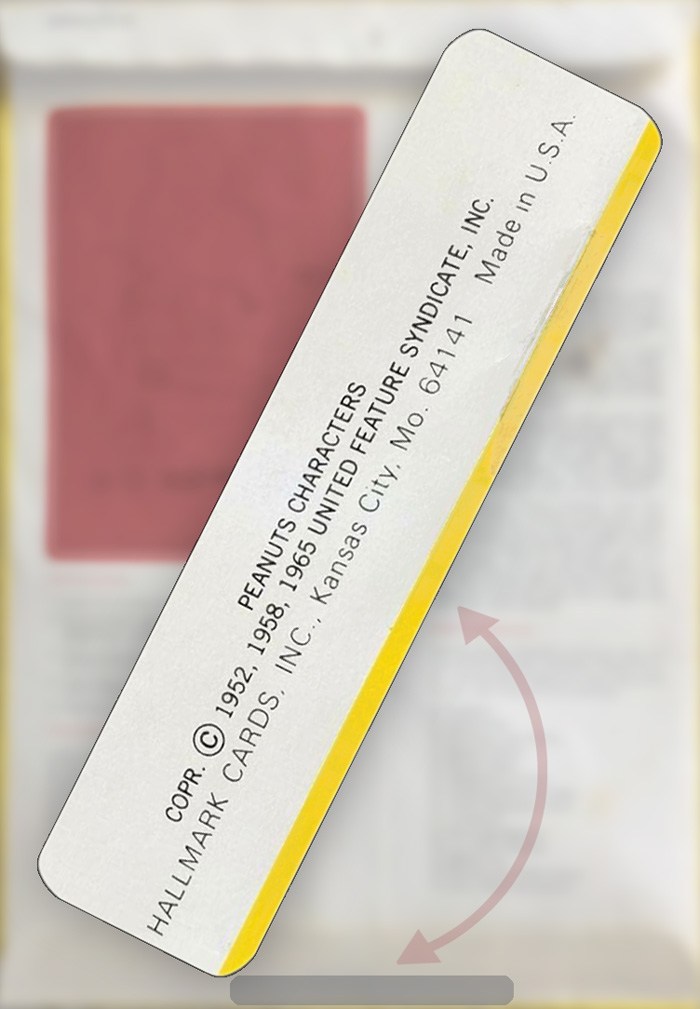
Hallmark creates licensed items (as above) across decades. When placing a date on these, be sure to consider who the copyright mentions as this may not relate to Hallmark’s product. One of the first dates directly attributed (as seen by THR) to Hallmark Cards, Inc. occurs in 1976 with Barnaby Bunny Centerpiece.
Across the 1970’s:
Hallmark -> Ambassador
As in Hallmark Halloween 1960’s, Ambassador at times adopts the retired designs of main company Hallmark. This is interesting in the following examples because in “Pumpkin Patch” Centerpiece (below), very minimal updates occur between markets. However, the “Haunted House” Centerpiece (below) offers a glimpse at a transition in envelope design during its market shift (with Ambassador choices aligning to Hallmark design shifts of the later decade).
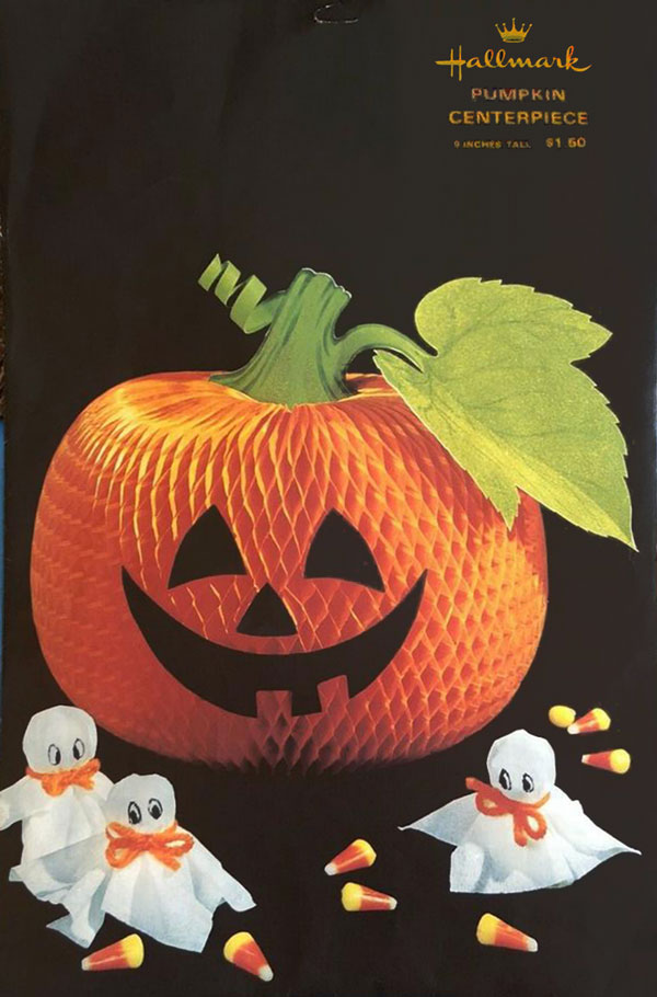
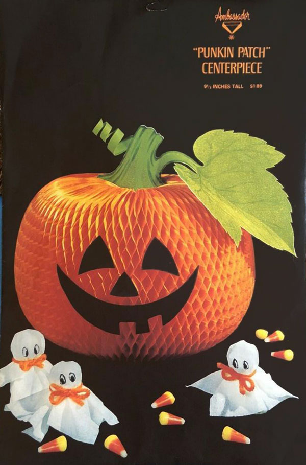
The many versions of the Hallmark and Ambassador honeycomb pumpkin centerpieces could in itself be an interesting timeline.
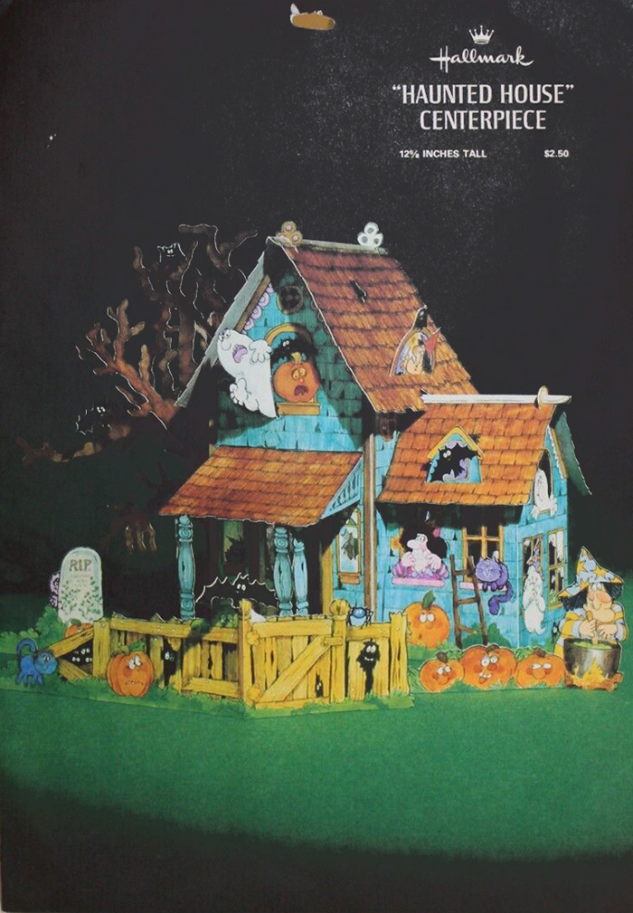
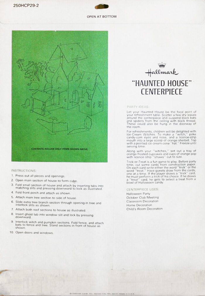
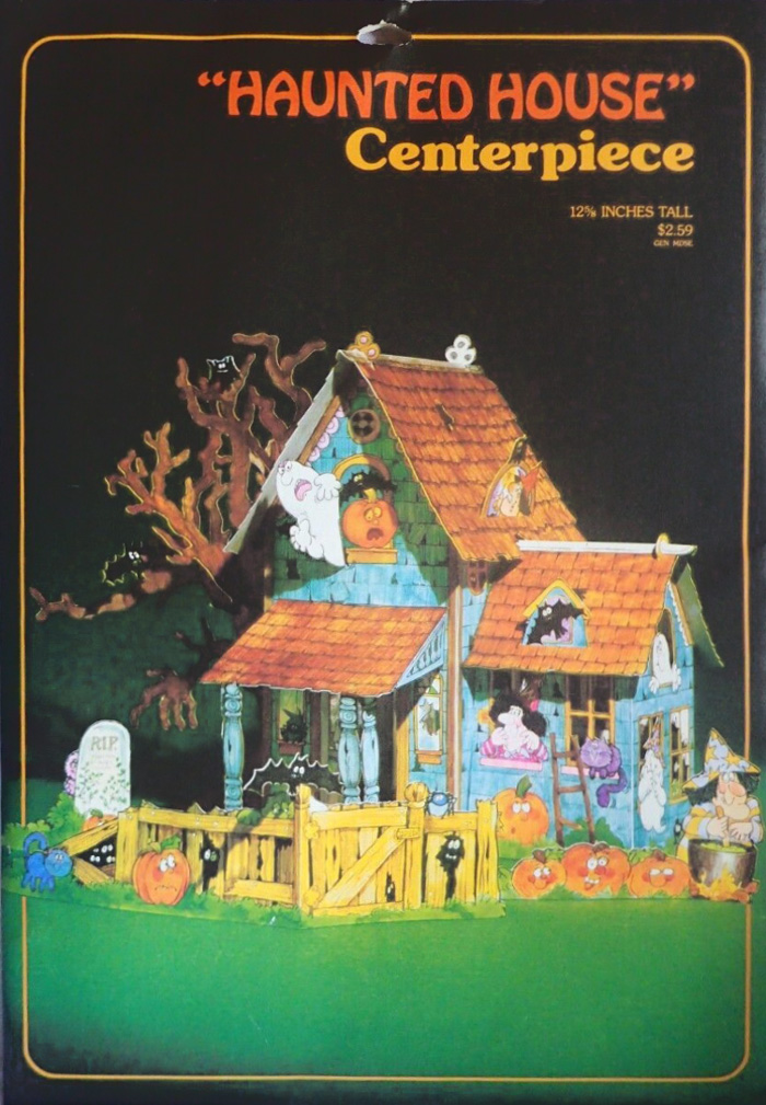
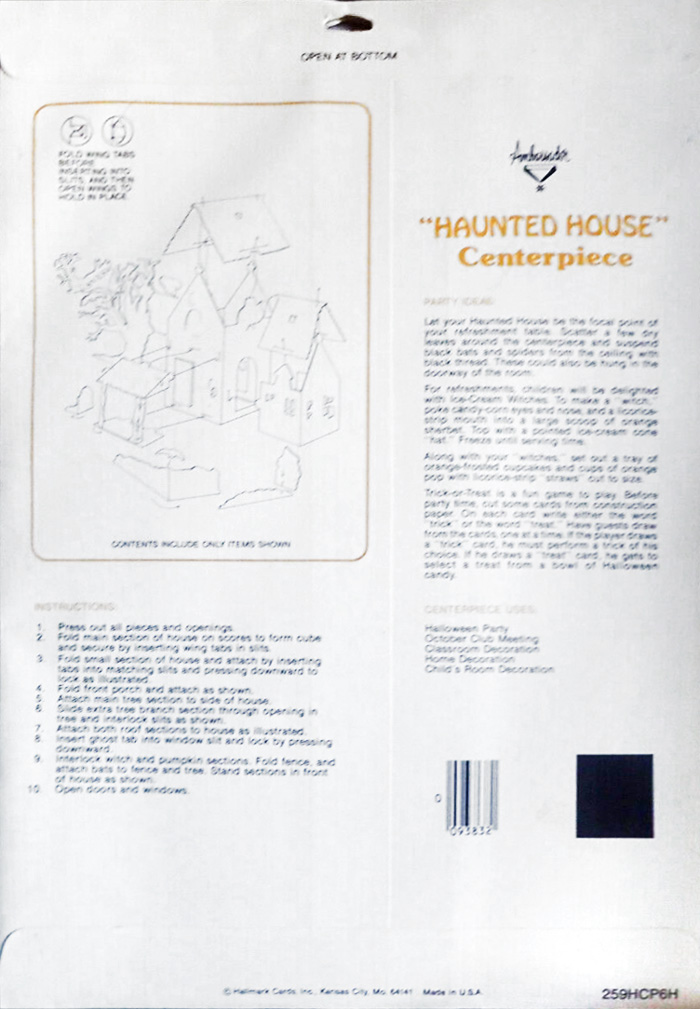
Releases (above) of “Haunted House” Centerpiece, Hallmark 250HCP29-2 and Ambassador 259HCP6H. The Hallmark version maintains a typical layout for 1977 (date recorded by Hallmark Archives), while the Ambassador version appears to arrive at a time of changing design elements toward the next aesthetic (of the 1980’s) and notice the barcode addition.
Into the 1980’s:
New Brews
So here we are, at the end of the 70’s. The item below has a Hallmark copyright date of 1980 offering a culmination of packaging progression (and readers may wish to look up similar examples such as Bells of Love Centerpiece copyright 1979). From here The Halloween Retrospect makes an exit from this area of research – since the timeframe focus for the archive library ends at 1980 – but if readers can offer a great resource for Hallmark identifications after this period, send a link and the author will be sure to add it here.
For previous decades see: Hallmark Halloween: 1950’s and Halloween Hallmark: 1960’s.
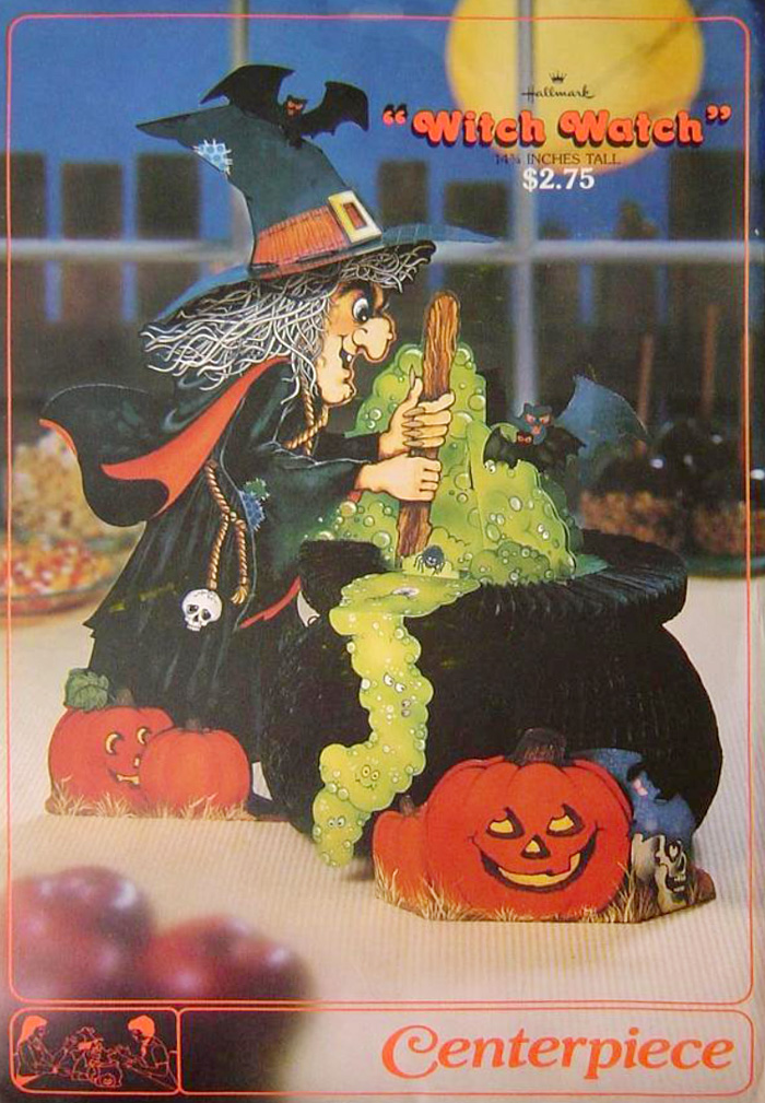
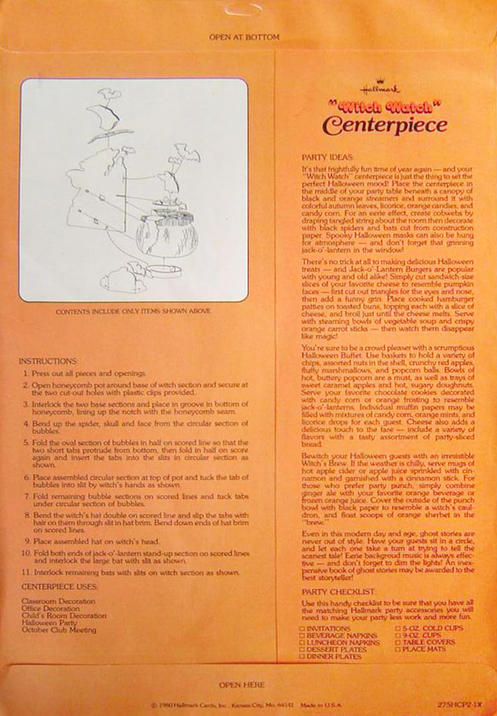
Copyright 1980 and end of the 70’s seen in Hallmark Witch Watch. (Digital representation).
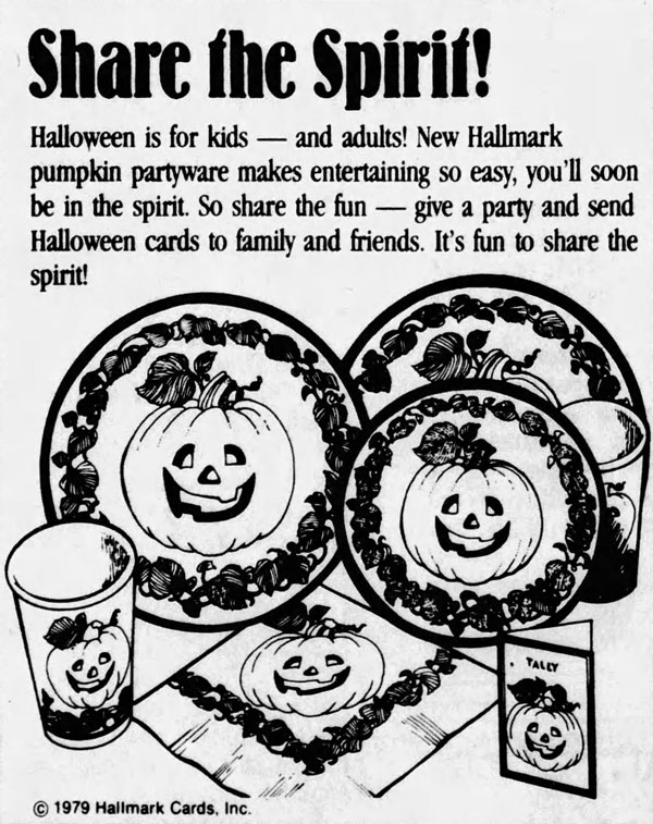
Oh, one final note… since there is reference to this at the beginning of this blog entry…
Think back to Normal Ad, Bogie Book 1926 and 1926 Halloween Poster, that debunk a theory that early Halloween designs were grown-up stuff, then consider the following ad from 1979. The copy reads “Halloween is for kids – and adults!” and offers a strikingly benign motif. Perhaps this is a a good explanation for the scant scares in this entry, yet doubly worth noting as counter to the reasoning of some who claim Halloween is at times scrubbed of all spookiness for the kids… but exactly what group is spooked based on this marketing?
The review of Hallmark vintage Halloween includes:
The Halloween Retrospect
Volume 3
Here is a link to more website info about The Halloween Retrospect (a new research-based guide on the vintage market of for Halloween collectors) and here is a direct link to The Halloween Retrospect bookstore to purchase a copy via Etsy checkout.
Follow THR on Instagram @halloweenretrospecs
Follow THR on Facebook Halloween Retrospect
